Dream Palette Rolls Out Across Templates, Tasks & Targets
A unified color system ties every template pill, target badge, and calendar card back to the warm Dream Journal palette.
By BreakToGoal Team3 min read
#design-system#templates#targets#calendar
Rollout Notes
- New Dream color tokens – We now publish fern, apricot, lagoon, sky, lilac, blush, and sand families as shared CSS variables plus TypeScript helpers. Anything that needs an accent (buttons, badges, borders) can request the same token instead of hard-coded hex values.
- Template + task UI refresh – Template pickers, difficulty chips, and the task selection drawer borrow those tokens to stay consistent. Selected rows, completion inputs, and reward badges all respond with the same warm neutrals and optimistic accents you see elsewhere.
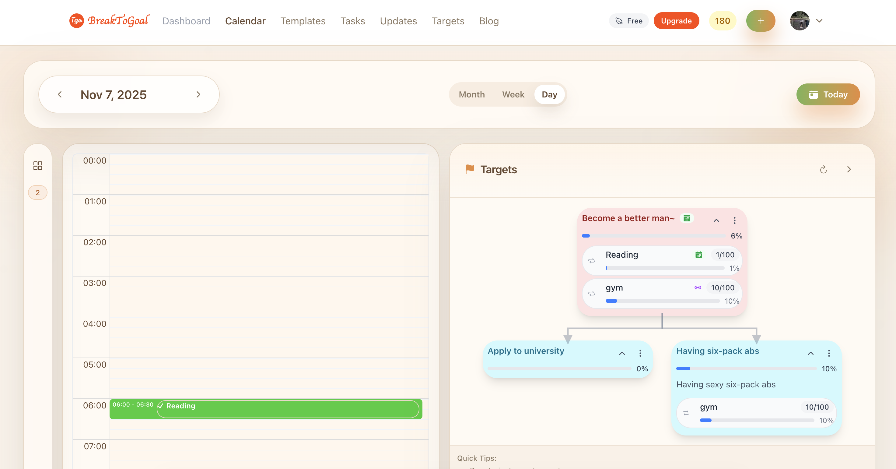
- Target & calendar alignment – Target list/kanban cards and calendar event shells read from the color system to show status (planning, active, paused, completed) without drifting into random blues/greens. Entertainment events, milestone badges, and the append-task modal now feel like they come from the same kit.
Everyday example
When you open the Targets sidebar and append “Morning Mobility” from your wellness template, the pill you click, the confirmation drawer, and the resulting target badge all glow with the same lagoon accents. Later, when you drop that template onto the calendar, the event inherits the identical fern or lilac tint. No more guessing whether a badge belongs to work or wellness—the palette does the talking, and the whole product looks like one cohesive journal.